Technical Writing – 7 Time-Tested Principles to Design a Cover For a Technical Document
© Ugur Akinci
If you are a technical writer working for a company as a payroll employee, you might be working with corporate design guidelines that define what you can and cannot do to design the cover of your technical document.
But what if you are a “lone writer,” an independent contractor working out of your home office, or an employee who is asked to come up with a corporate design guideline?
Here are seven time-tested design recommendations culled from my 20 years of experience as a professional writer, page layout and information designer:
1) Keep it simple. Limit your design elements to the following components:
a) Title b) Product/Service photo or image c) Company logo d) Footer
2) The cover should include (if applicable) version or release number, as well as the document number.
3) Footer should include date of release, copyright and confidentiality (if any) information.
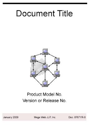
 A technical document cover with a very few basic elements… When it comes to cover art, “less is more.” Easy does it. (Illustration Copyright 2009 Ugur Akinci)
4) Leave as much white space as possible for the eyes to rest. Don’t crowd your cover page with multi-colored pictures, or fonts in different color. Try to limit your color choices to your approved corporate or client colors.
5) Leave out your name unless specifically requested by the management or the client. Anonymity comes with the territory. Your reward in technical writing is helping others accomplish complicated tasks and perform technical procedures, plus, a usually above-average monetary compensation.
6) If you have a lot of text and graphic elements on the cover page do not center them like most amateur designers do.
The natural sweep direction for the eye is from upper-left down towards bottom-right. Try to align your text and images along that diagonal for easy reading.
HOWEVER, if you have just a little text and a single image (as shown in the illustration), then it’s okay to center your page elements since there isn’t much to read and stress the eyes.
7) Be conservative and traditional about your color palette. Less is always more.
Resist the temptation to splash on ten different colors on your cover.
And when you do have only two or three colors, select traditional colors. Blood-red letters on a pitch black background might be a great color choice for a punk rock web site but that combination does poorly on the cover of a technical document.
